Project/app description:
Name of App: Paymare
Paymare is a finance app that primarily deals with tracking, budgeting, and savings that also helps with subscriptions, tax filing, market charting, and financial literacy. Depending on the platform, it serves as a hub for self-financial audits and monitoring your assets and liabilities. It helps keep your finances organized and helps with reminding the user through push notifications and set reminders. The goal of the app is to help the user become financially conscious, organized, and smart while providing tools to help streamline specific financial processes.
Feedback summary:
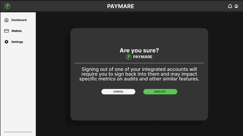
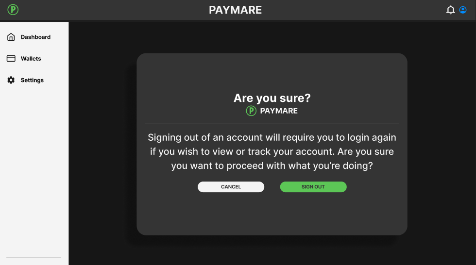
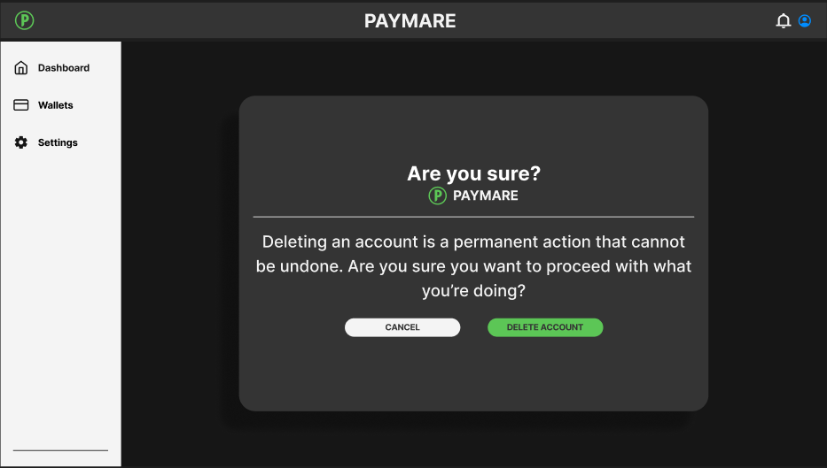
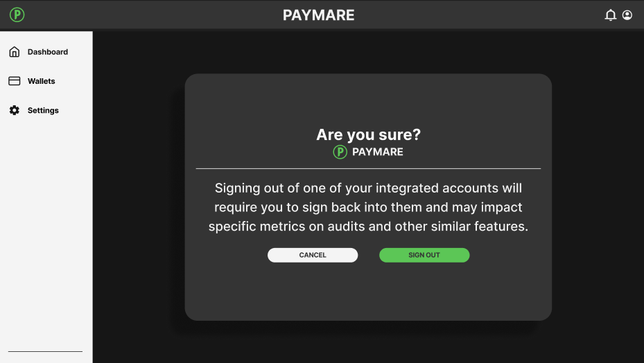
In short, there were many things that the users enjoyed about Paymare but there were some outstanding flaws that had been pointed out by the participants. All users of the app expressed their liking of the foundational UI design and claimed things such as ““Everything is easy to read and look at”. This was a reoccurring statement among the participants. Despite the user’s praises and acknowledgements of the overall UI and design of the app, there were some non-intuitive and confusing aspects of the design. Users expressed friction and frustration in two primary areas, one being the first time user sign-up process and account creation, and two being the “adding a card feature”. Users also expressed confusion in a task where they were required to sign out of an integrated wallet, but through heavy scrutiny and analysis, I concluded that most of the confusion laid in an unclear prompt and lack of alt text. By addressing these issues and tweaking parts of the app to better fit the user, the overall experience and process of using the app will become smoother and intuitive.
Usability issue 1:
One of the most outstanding usability issues that my testers ran into was a confusing account creation process and first time user onboarding. Logging in was no issue for the participants but signing up was confusing and not very efficient. There was a lack of clarity and the process in general wasn’t the smoothest. To solve this, I added extra screens and better direction for first timer users. The addition of confirmation screens and an extra “already have an account? sign in here” help frame the current step of the process for a first time user. It also provides a confirmation for the user and allows for an easy gateway towards the main hub of the app.
BEFORE
AFTER

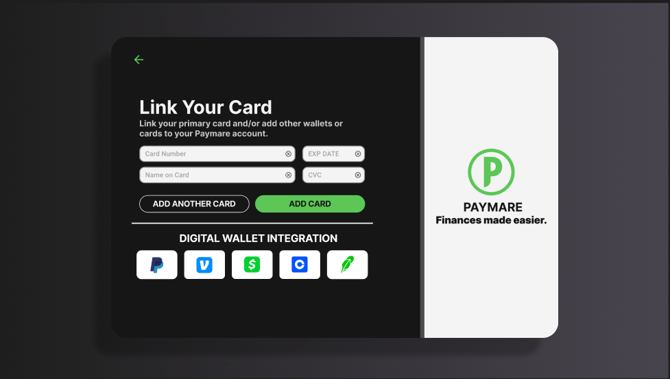
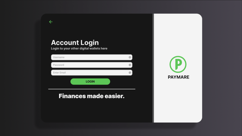
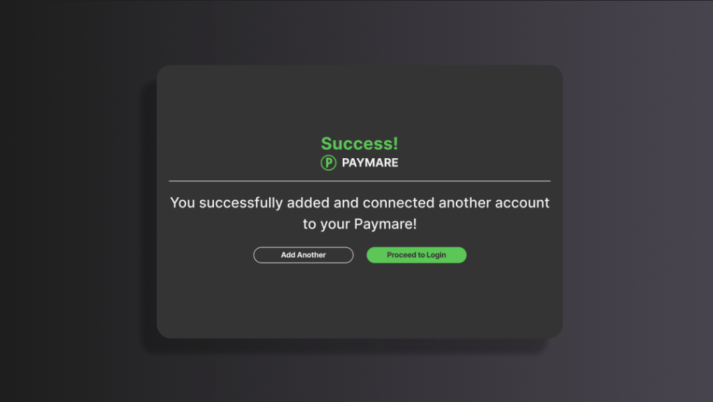
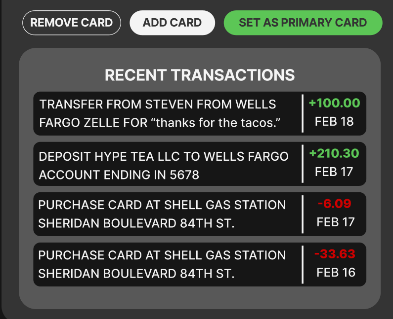
USABILITY ISSUE 2:
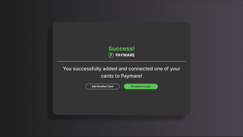
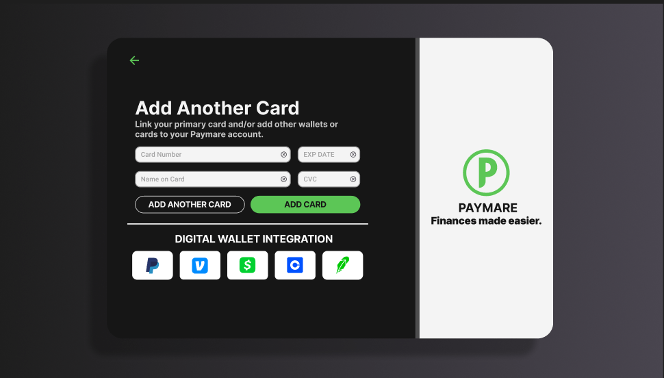
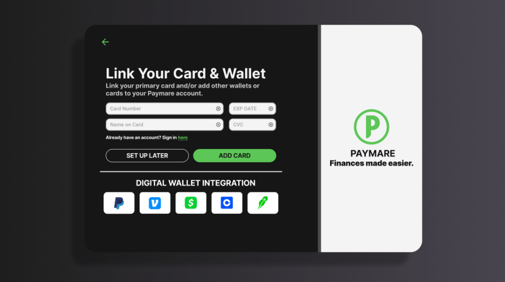
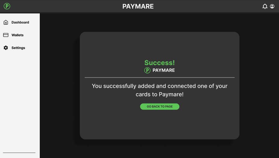
The second issue I wanted to change was the restrictive process of adding a card or connecting a digital wallet as a first time user. One of my test participants noted that they wish they could do the “add card” feature later in the process, rather than being forced to connect anything when first signing up. I believed that this was indicative of a more constraining process and may deter/annoy first time users. To fix this, I replaced the “add another card” feature with “set up later” so the user can just go straight to the dashboard rather than being forced to connect anything. I also decided to move the “add another card” feature to a confirmation screen after connecting an initial card to remove any unnecessary extra screens. I also integrated this concept into a new digital wallet confirmation/login screen which I did not have prior.
BEFORE

AFTER
Accessibility issue 1:
The text in this app checks most of the accessibility boxes (13px or higher, high contrast, clean fonts), but the text falls short in paragraph statements. A lot of the text in the paragraphs felt too close to one another, possibly making the copy harder to read. To fix this, I went ahead and increased the line-height by 1.5x the original to space out the text for better legibility and easier reading.
BEFORE

AFTER

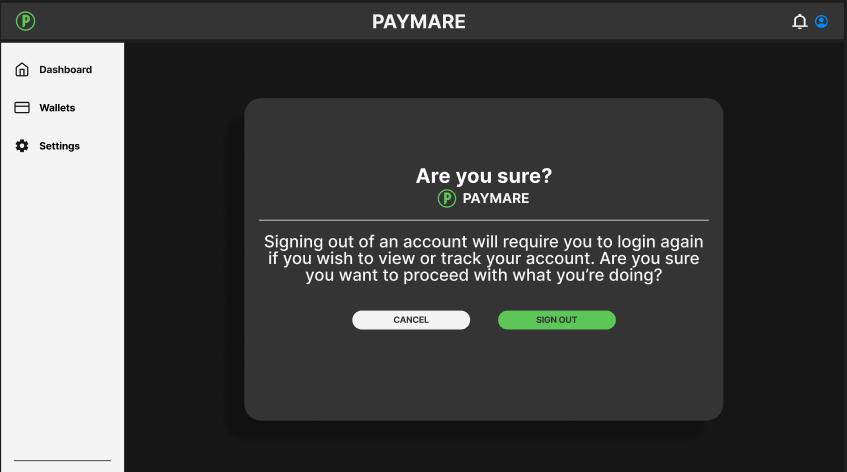
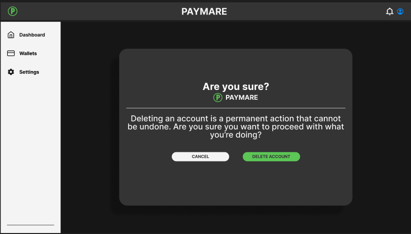
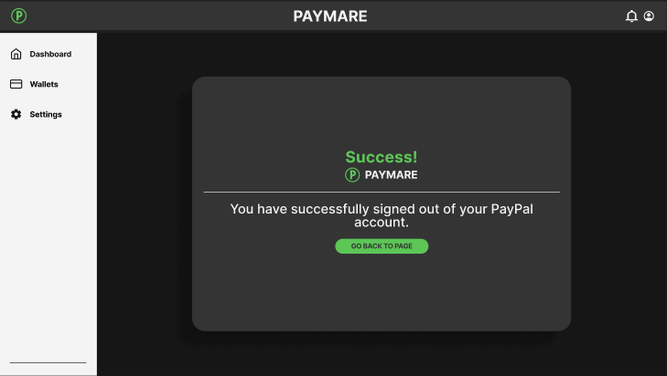
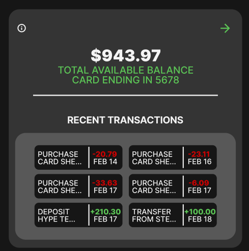
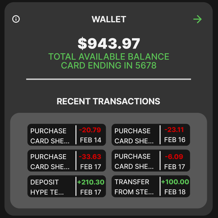
Accessibility issue 2:
The second accessibility issue was the lack of clarity in certain parts of my app, despite all the other features having alt text or informative icons. This caused a lack of cohesion and decreased clarity for some of the main features of my app. To fix this, I went ahead and added titles to inform the user what exactly they were looking at to make it consistent with the rest of the app and to clarify any initial confusion.
BEFORE

AFTER
What have I learned about usability and accessibility:
By doing this assignment, I was reminded that UI design is a combination of making things aesthetically pleasing, but also intuitive and easy for the user. Similar to any designer (like interior, product, web, etc), our job is to create something with the user in mind. I learned that there are many nuanced things in a design that could make using a product hard for specific demographics and I also learned that first impressions count. If an app doesn’t provide a smooth and intuitive experience for the user and isn’t very pretty to look at, it can drive away any first time users because of any potential friction with the UI.

