PROJECT BRIEF
The aim of this project is to create a reflexive/responsive app. Depending on the device, the goals and focus of the app might vary depending on the platform. User goals tend to vary from platform to platform, so it’s important to learn how to create an app that aligns with these goals across multiple devices. Juggling to keep the app cohesive enough for efficient use but different enough to meet specific user objectives is the underlying target of this project. Our primary focuses lie in innovating specific areas of choice to optimize for platform design while keeping the overall app cohesive and easy to use across all devices. In doing so, we will have to create a Figma prototype of an app that is reflexive across multiple screens, being desktop, mobile, wearables, etc.
PROJECT IDEA
Subscription plans, student loans, credit card payments, mortgages, insurance, and phone plans are among some of the many bills that a person may have to look out for (René, 2024). Expenses tend to pile up, and people tend to regularly struggle remembering pending payments. A study conducted in 2022 showed that 42% of people who purchased a subscription forgot that they were still paying for it, despite no longer using the service (Tindall, 2025). It can often get overwhelming and be challenging to track in a convenient manner, but with Paymare’s user-friendly and practical interface, users will find keeping track of expenses a much more straightforward process. In addition to streamlining expense tracking, Paymare offers real-time push notifications to notify the user of upcoming payments to keep customers on track. Users will also be able to set budgets and set savings goals for themselves. Furthermore, Paymare helps their users become more financially literate through quick tips and context/descriptions to unknown metrics and jargon. Users of Paymare will be able to track/organize expenses, monitor markets, cancel subscriptions, view detailed and curated financial reports, budget, set savings goals, file taxes, and become more financially literate.
WORK COMPLETED
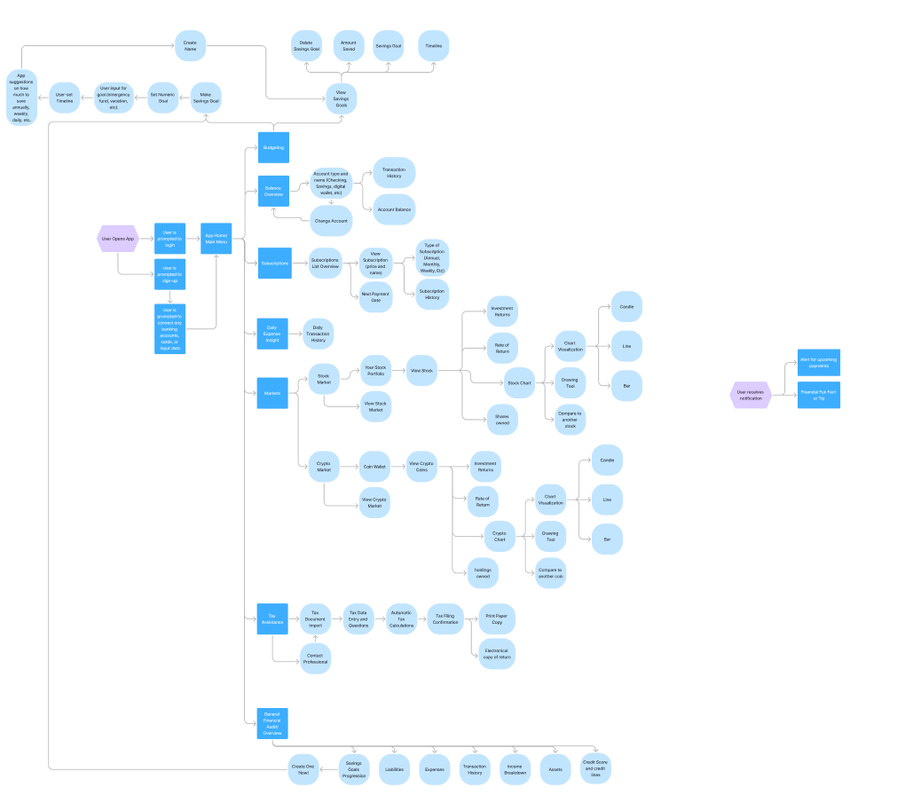
In this project, I utilized Figma to create multiple high fidelity versions of my app across multiple devices to simulate a responsive design. To achieve this, I first devised an idea for the app by thinking about some of the problems that I had to face whenever I would use my electronics. I decided on creating an app called Paymare, an app that primarily focused on tracking, budgeting, and savings that also helps with subscriptions, tax filing, market charting, and financial literacy. It also helped keep your finances organized and reminded the user of payments through push notifications and set reminders. Because of the project’s complexities, it was necessary to first plan out the design and what the goals of the app were. I created a written plan for the app through a design strategy template, where I then explained user goals, drew app wireframes, completed relevant research, laid out app features, considered responsive design choices, etc. After this initial process of developing a design strategy and creating app wireframes, I then went and created a mind-map to design the overall structure of the app and visualize how each of the features would work in relation to one another (From planning to wireframing to mindmapping, this took around 2 weeks). After creating the framework for the app and having everything planned out, I created a mobile version of the app. I created 11 carefully designed screens with prototyping for my mobile section of the app, which I then used as a foundation to create my other devices screens (over the course of 2 weeks). In addition to the mobile screens, I chose to make screens for desktop and an Apple watch. Varying from device to device, I made platform specific optimizations to streamline the process of using the app, aligning the user’s goals with app design to make using the app more efficient. I made 18 screens for the desktop version (over the course of 2 weeks) and 5 screens for a wearable (over the course of 2 weeks). After completing the first draft of my screens, I then did user testing to test my design and evaluate app functionality and efficiency. I created a usability test plan of 5 tasks that multiple participants had to complete. While completing the tasks, the participants were required to record themselves navigating through the tasks and then give their feedback at the end of the video (over the course of 2 weeks). At the end of the user testing phase, I collected all feedback and did an analysis on pain points and points of friction during the tasks. By further scrutinizing my design and taking in my usability test feedbacks, I made some minor tweaks and revisions to the screens. The study found that parts of my design were a little bit confusing and unnecessary, so after expediting processes like account creation and disconnecting integrated wallets, I went ahead and also did some accessibility changes such as making texts larger and adding alt text (over the course of a week).
DESIGN STRATEGY
INDIVIDUAL SCREEN DESIGNS
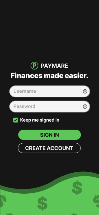
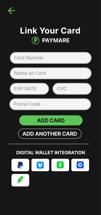
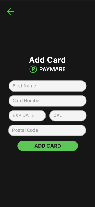
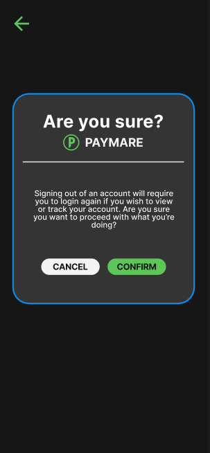
MOBILE


DESKTOP

Desktop – Signing in or Account Creation 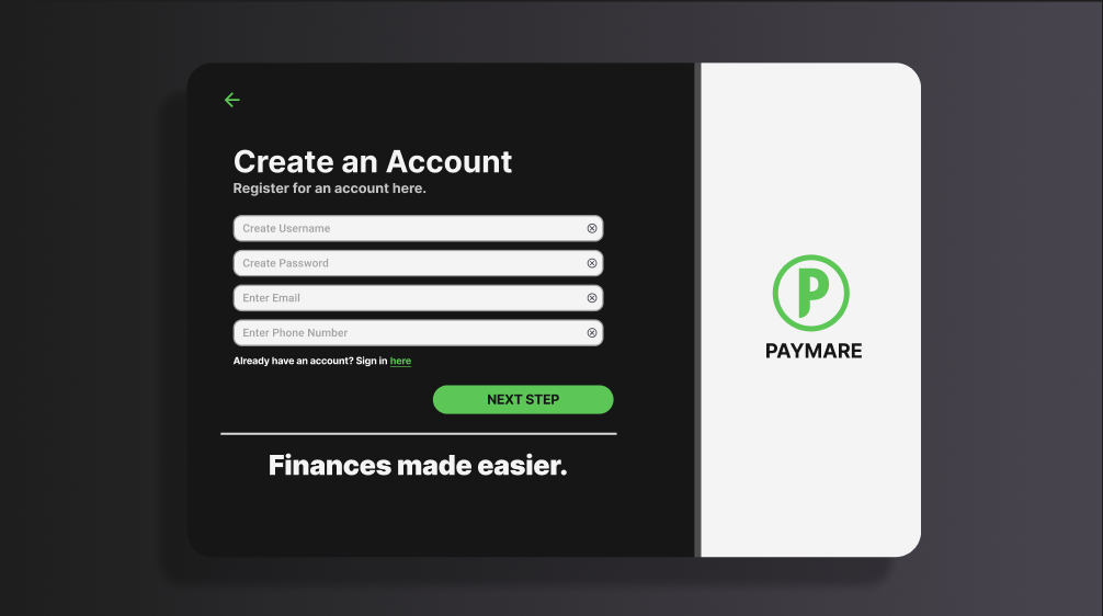
Account Creation 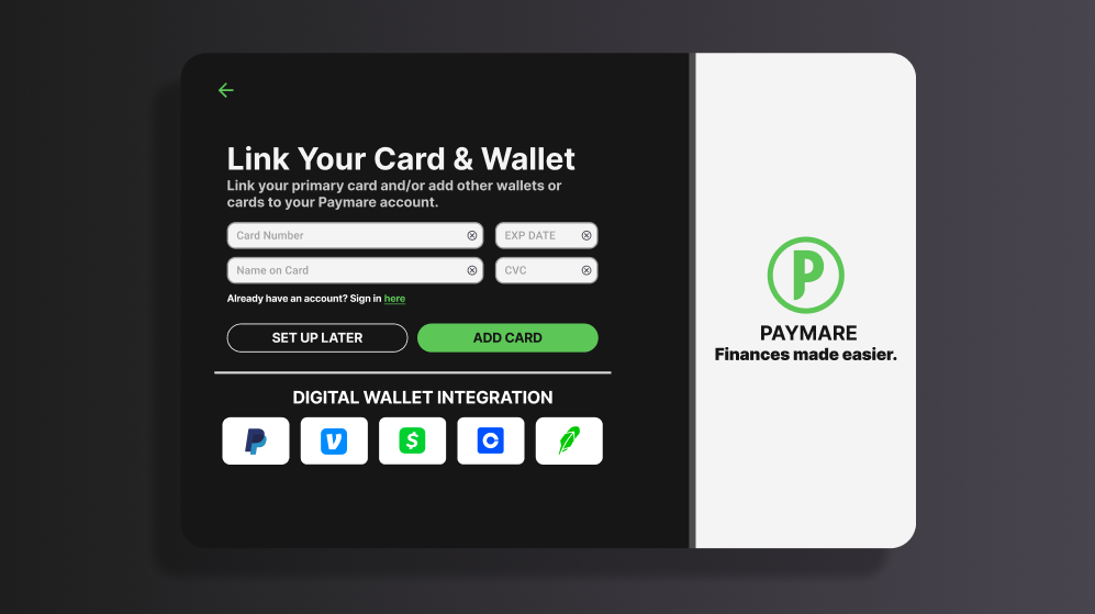
Link Card or Wallet 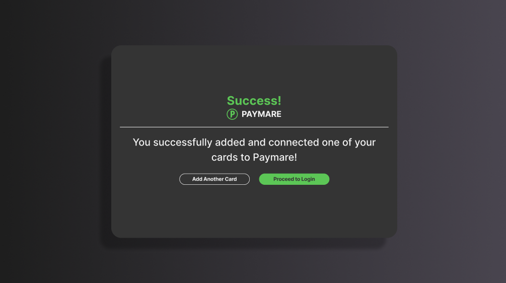
Confirmation for Connecting a Card 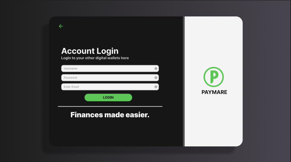
Integrated Account Login 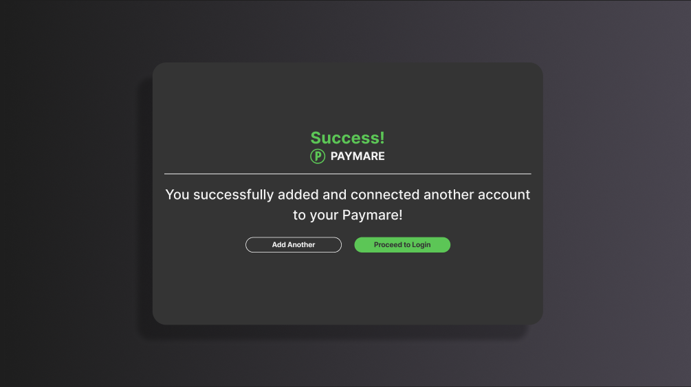
Confirmation for Connecting an Integrated Account 
Dashboard 
Subscriptions List 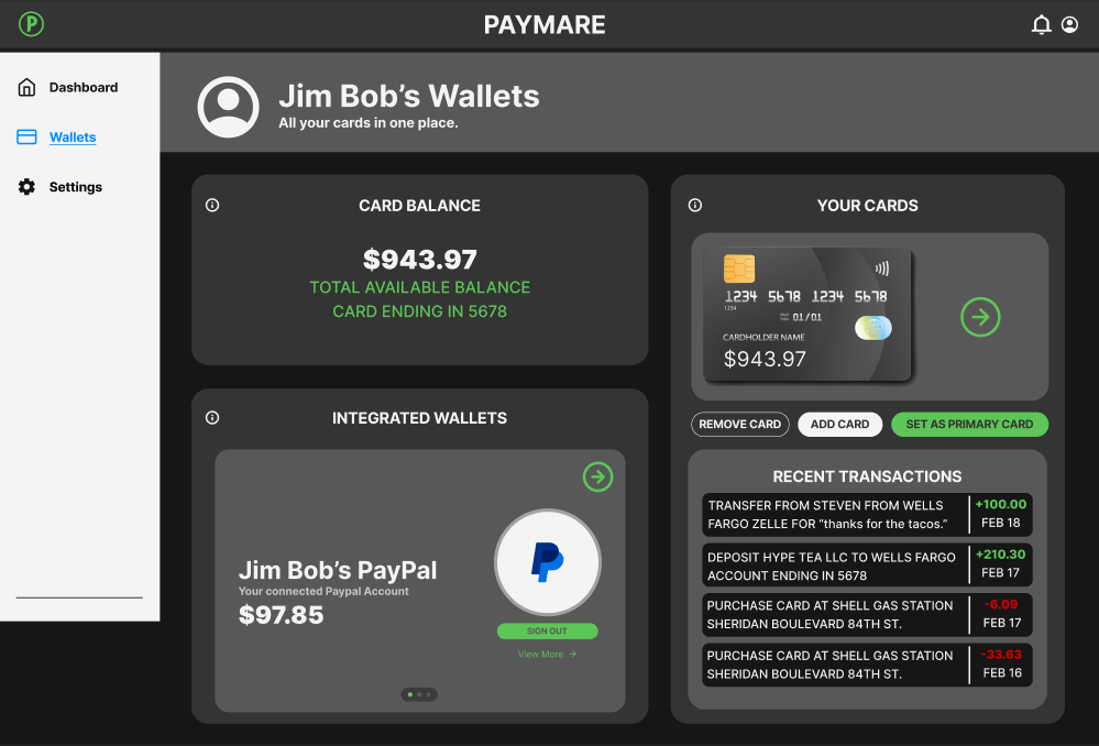
Your Wallet 
Add Card or Wallet (if you didn’t do it during signup)) 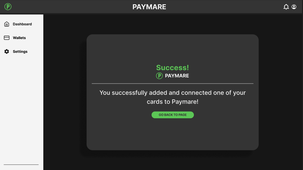
Confirmation for adding a card (in-app) 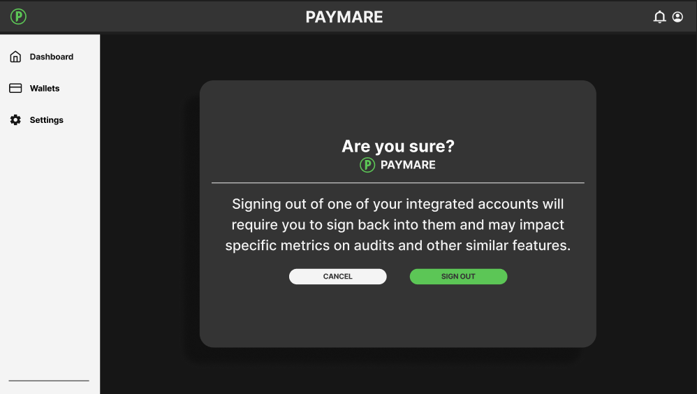
Confirmation for signing out of integrated wallet 
Successfully signed out of Integrated Wallet 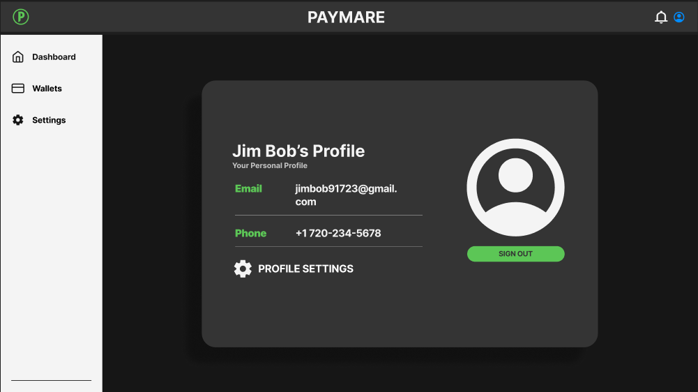
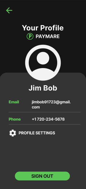
Your Profile 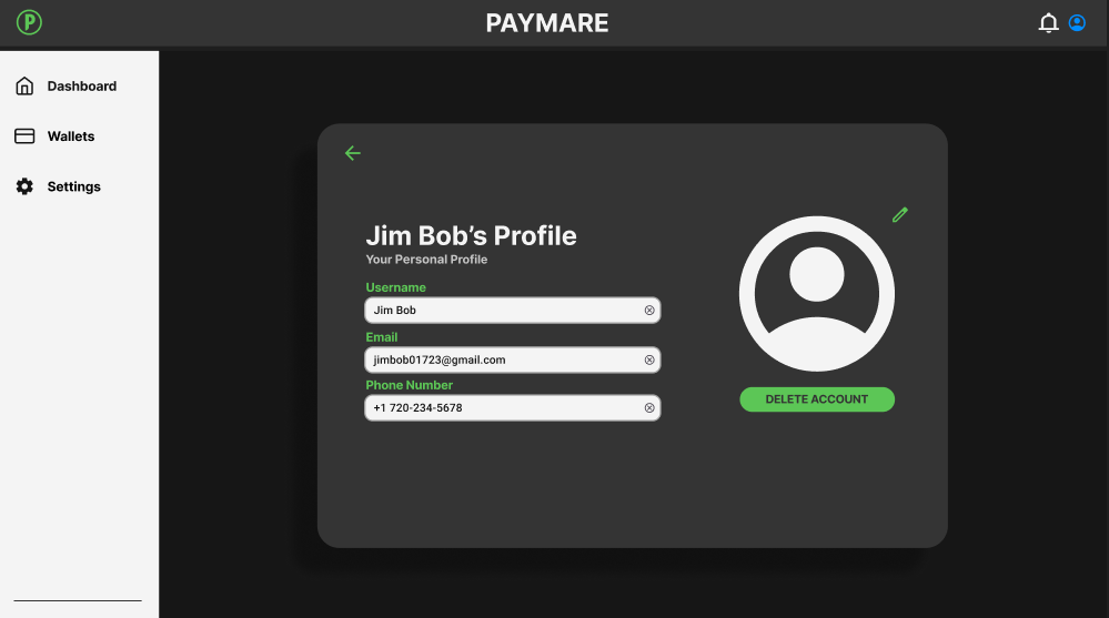
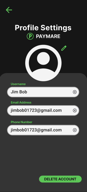
Profile Settings 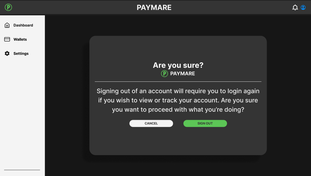
Confirmation for logging out of Paymare 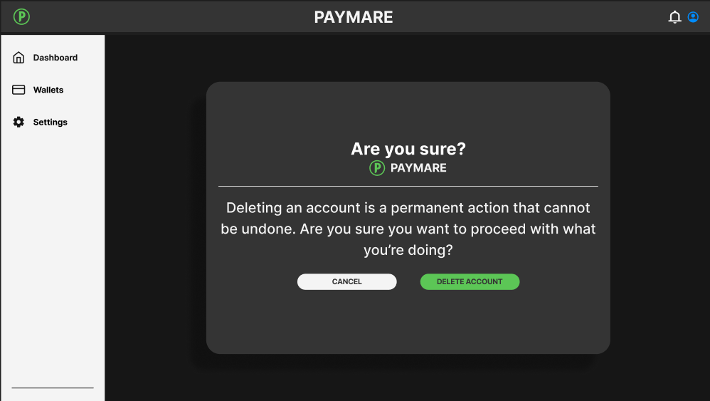
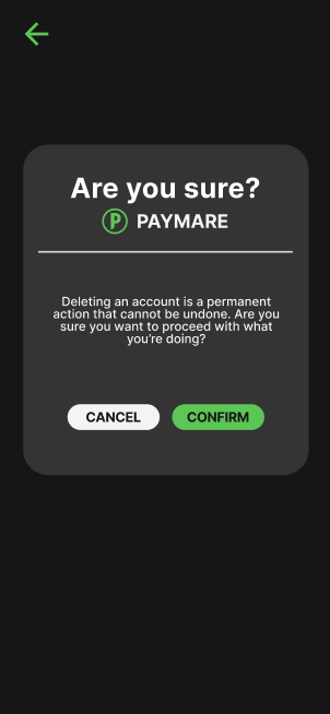
Confirmation for Deleting Paymare Account 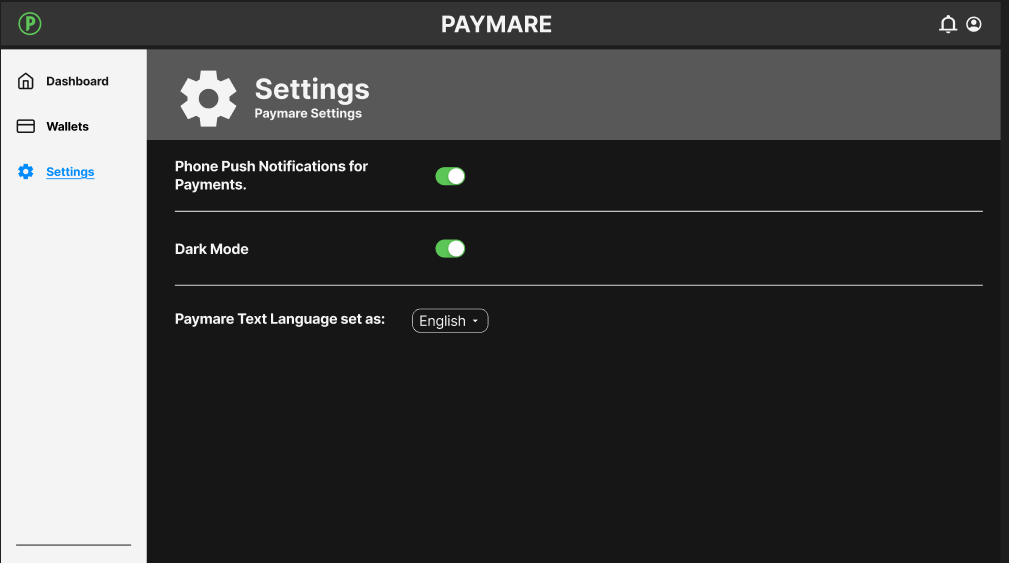
Paymare Settings
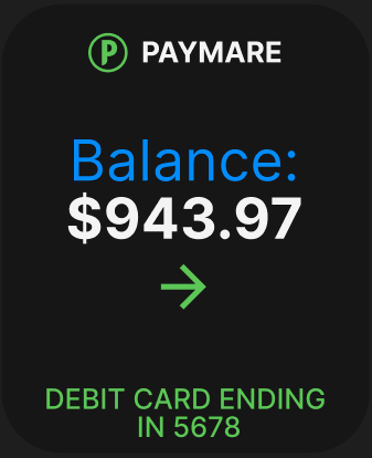
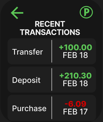
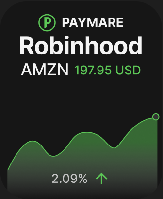
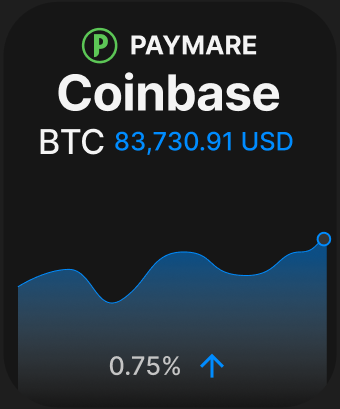
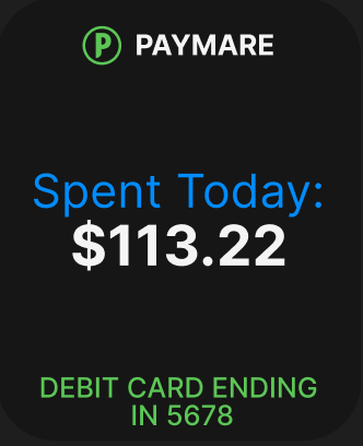
WATCH
USABILITY TEST FEEDBACK
WALKTHROUGH
Prototype and flowchart
Mobile: https://www.figma.com/proto/xijda2JQSBpCzMR591y5Ad/Paymare?page-id=0%3A1&node-id=35-825&p=f&viewport=696%2C366%2C0.62&t=JwPOlwrvVzalKQFu-1&scaling=scale-down&content-scaling=fixed&starting-point-node-id=5%3A2
Desktop: https://www.figma.com/proto/xijda2JQSBpCzMR591y5Ad/Paymare?page-id=1%3A3&node-id=190-2377&p=f&viewport=279%2C258%2C0.29&t=0WgENfbgVVWlWqjX-1&scaling=scale-down&content-scaling=fixed&starting-point-node-id=158%3A449
Watch: https://www.figma.com/proto/xijda2JQSBpCzMR591y5Ad/Paymare?page-id=1%3A4&node-id=237-1668&p=f&viewport=-1778%2C-368%2C0.29&t=k53DUei1PWPp0fXl-1&scaling=scale-down&content-scaling=fixed&starting-point-node-id=228%3A739
Mindmap/Flowchart: https://www.figma.com/board/zcqQAD6nXy8HG83DHwqCgH/Paymare?node-id=0-1&t=GoMdTmPm8adWrflu-1
SOURCES AND CITATIONS
Bennett, René. “Monthly Expenses to Include in Your Budget.” Bankrate, June 25, 2024. https://www.bankrate.com/banking/monthly-expenses-examples/
Tindall, Tommy. “Subscriptions Are Hard to Cancel and Easy to Forget – by Design.” NerdWallet, January 27, 2025. https://www.nerdwallet.com/article/finance/subscriptions-are-hard-to-cancel-and-easy-to-forget-by-design#:~:text=A%202022%20study%20by%20brand,on%20monthly%20subscriptions%20by%20%24133
https://www.youtube.com/watch?v=MTKttcfEkKk&pp=ygUiaG93IHRvIGNyZWF0ZSBkcm9wIGRvd24gbWVudSBmaWdtYQ%3D%3D

